
A FEW WORDS ON…… Framing your images
This is a topic which is likely overlooked by many photographers however in my capacity as a gallery owner of 7 years I think I can add some value for anyone reading this, and hopefully steer you towards getting the right result on your printed image.

Sizes and aspect ratios
This is something that catches a lot of people out (understandably), for the most part as photographers we simply compose and take the image in the aspect ratio / orientation that best suits our eye, then worry about it later. When it comes to printing and framing, it’s worth taking these factors into consideration even during the shooting process if printing is ultimately what you wish to do with the image.
Most people for cost reasons want to buy ‘off the shelf’ frame solutions, like Ikea or The Range etc. which is fine for the most part, though you’ll only be able to work to standard sizes and aspect ratios, the most common being a 3:2 aspect. The ever popular 4x5 vertical crop for things like Instagram isn’t a standard off the shelf size for example, you’ll probably find more 1:1 (square) options available. The 3:2 is fine if you’re a full-frame or APSC user, not so hot for micro 4:3 or medium format (though medium format you’ve a lot more MP to play with). Some guidance on the most common print sizes:
9x6 print – 3:2
12x8 print – 3:2
16x12 print – 4:3
22x16 print – roughly 3:2
16x12 (about an A3) is usually the sweet spot for people home printing on an A3+ printer, which rather annoyingly is a 4:3 aspect, so if you’re thinking about printing and framing at this size, consider the crop from a 3:2 frame to a 4:3 when shooting.
Of course, this advice is based on store bought frames and mounts however if you take your image to a framer, they can mount and frame to any size and aspect you like. It is however worth considering that if you were planning on putting a few images up on your walls in your house, it’s prudent to keep some element of uniformity to the sizing of your images, so even if they end up being custom sizes, it’s worth keeping them consistent.
There’s also several online retailers who will produce custom mounts and frame sizes for you, though expect to pay a little more for these than you would standard sizes.
Frame finishes
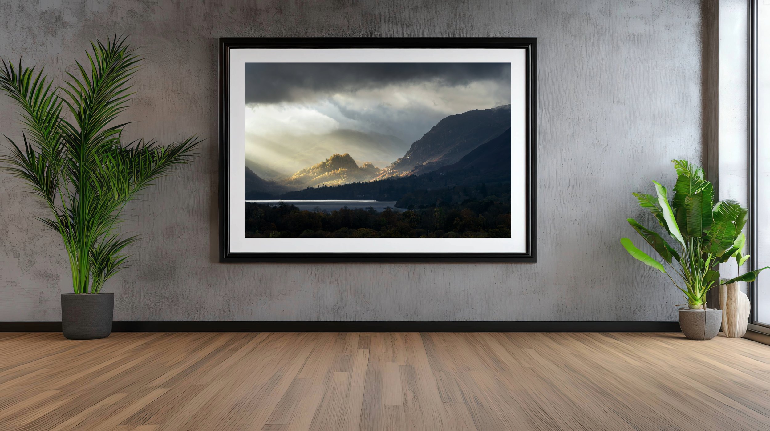
A mock up of a typically ‘dark’ image with a compimentary dark frame
This is purely personal preference so this rests with the individual. In my gallery, I’m always framing purely for the image and what will compliment it best, I’ve no regards for the wall colour or the décor, as it’s a gallery space not a living room. This won’t be the case for you, so it’s worth keeping those other factors in mind. When it comes to the image itself, as a rule of thumb anything with a lot of contrast (dark skies etc.) can usually take a dark frame of some sort, I tend to steer clear of light wood frames on these as the clash in colours is too great. Conversely, softer / brighter images tend to work well on woods such as oak and beech, depending on the shade. Some images can happily sit on either finish, though as a general guide I’d say avoid any frame finish where it’s clashing with the tones of the image, this is just common sense. Black and white / minimal images with monochromatic palettes I find work well with straight black or white frames, nothing with any texture or grain in.
Matting
Again, a personal preference though I like to keep this very simple with clean white mounts. I’ve seen some wild and wacky mounts in my time which framers offer as options for people (like black or grey with gold trims etc) however I tend to steer well clear of these as while they may be fashionable at the time, they tend to look dated quite quickly. Think of those old photos your nan had up on the mantlepiece with weird mat finishes, they immediately look dated. My advice is to go with mats that are simple off whites / egg shell whites with a bit of texture in them, the ones without any texture look a bit odd and stark. Again, like the frames I’d avoid brilliant white mats as they clash too much with the image and look too bright. The only time I’d even consider them is on a black and white photo where the starkness can help. For an extra touch of elegance, you can get the framer to double-mount the image to give the finish a more three-dimensional look. This can look even more effective if you print with the border showing.
Glass
Museum (left) vs standard (right and above) note the stark differences in reflectivity
Probably the thing which will make the biggest difference to the look of an image, far more than any extravagantly priced lens will anyway. The three types of glass I encounter in the gallery are as follows:
Standard – does what it says on the tin. Will work well on most images, can be quite reflective in some environments. Some loss of contrast in some situations but not a deal-breaker in most cases. I use this for most of the stuff you’ll see in my gallery.
Anti-glare – slightly more expensive that standard, cuts down reflections but at the cost of some loss of contrast. This can also come in the form of Perspex (anti-shatter) and does the same thing. In my opinion the loss of reflection comes at a cost of contrast, where the image can almost look a bit ‘cloudy’ which is why I don’t use this in the gallery, though offer it as an option to customers.
Museum – The best stuff, noticeably so, but also costs a hell of a lot more. In my opinion worth it though, as it’s not only anti reflective but gives the appearance of their being no glass actually there, which greatly improves the contrast and perceived sharpness of the image, to the point where it looks like you’re just looking at the print itself. Don’t confuse this grade with ‘anti-glare’ as the two are very different in terms of look and price.
The image here is a comparison of the difference (click to expand to see better), which even at low resolution you should be able to see a clear difference. For museum grade glass expect to pay 3 or 4 times as much as regular glass, with the cost difference on a large image quite significant, more than the frame itself. However, if it’s going to sit on your wall for many years, it’s worth it in my opinion as it really does justice to all that investment you’ve made in expensive cameras and lenses. It comes in several options, up to AR99, in my experience AR70 is the best value as it gives you probably 95% of the performance of AR99 for much less cost, though it’s still expensive. The AR99 stuff is what you see used on pieces in the Louvre or the Natural History Museum for example.
Lighting
Don’t skimp on this, it’s pointless following all the other steps then putting your image in a space which is poorly lit, so plan this out beforehand. There’s plenty of solutions these days for wireless spotlights etc. if this is an issue, or of course put some standard spotlighting in (if needed). If it’s going somewhere bright with a lot of natural light, I’d strongly advise the museum glass to cut down the reflections, it’s one of the issues I have in my new gallery space as the windows are so large the reflections are quite difficult to control.
I hope that’s been helpful to you, if you’ve any questions just get in touch!